Jodie McGrane
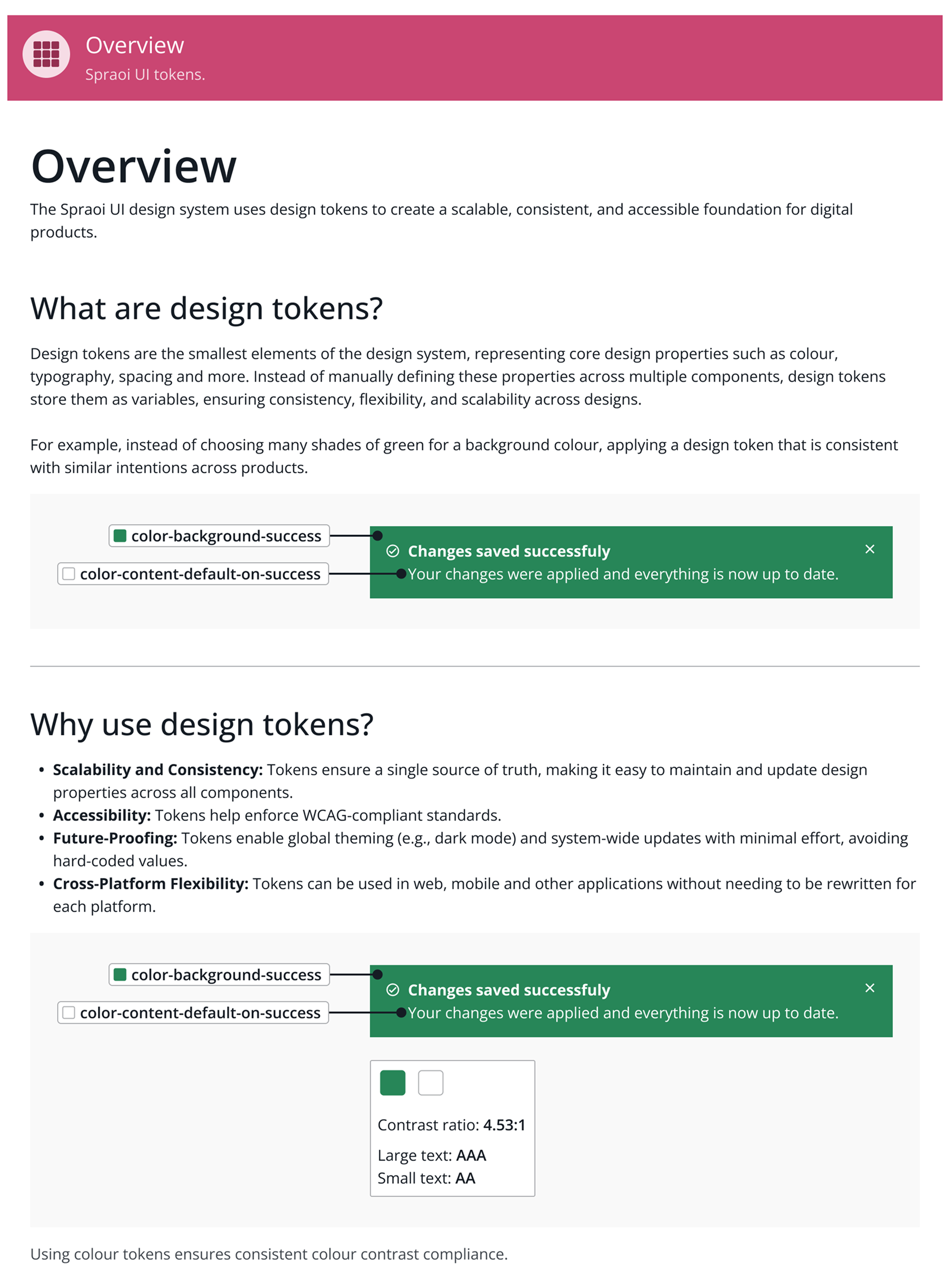
This project explores how design tokens, the foundation of design systems, can be structured to support accessibility by default. Focusing on the most common WCAG failure, contrast, the study investigates whether accessibility can be embedded directly into token architecture, naming conventions, and documentation. The result is a tested token system built in Figma that enables designers to make accessible decisions without relying on external tools. This project’s focus on real-world usability and system scalability makes it unique, proving that accessible design can begin at the token level.


This project explored how accessibility could be built into the foundational layers of a design system using design tokens. The main goal was to investigate whether accessibility, particularly WCAG contrast compliance, could be supported through token architecture, naming conventions, and documentation rather than relying on manual testing or external tools.
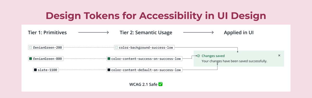
Through this work, I aimed to demonstrate how design tokens can carry accessibility intent, enabling designers to make compliant decisions by default. The project also examined how clear naming, visual documentation, and structured onboarding could improve usability and designer confidence, especially when working with non-standard components.
Ultimately, the project was about creating a practical, scalable approach to help teams design accessibly, starting at the system level.
This project explored whether accessibility could be embedded directly into the foundations of a design system using design tokens. The result was a fully developed and tested token system in Figma, grounded in accessibility principles and usability-focused design thinking.
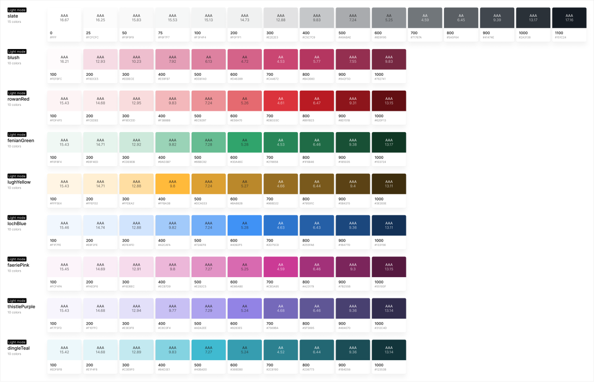
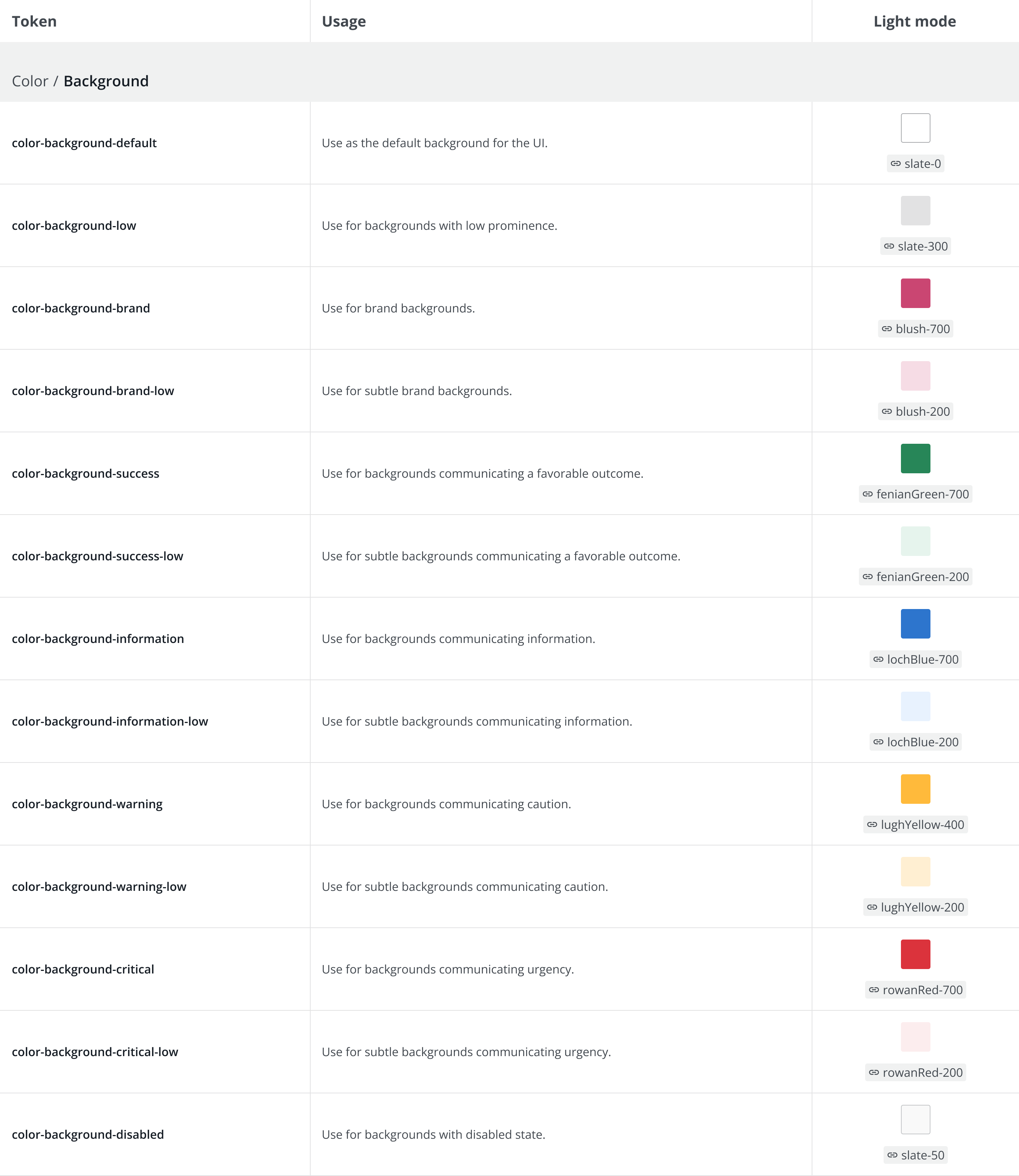
The final output included a design token system across colour, typography, and spacing, primarily focusing on colour due to the prevalence of contrast failures in digital products. The system was supported by visual documentation and a structured onboarding video aimed at helping designers adopt and apply tokens correctly, even when working beyond predefined components.
Usability testing showed that all colour token pairings passed WCAG 2.1 Level AA contrast requirements. The system also received a System Usability Scale (SUS) score of 86, indicating high usability and ease of adoption.
Key insights revealed that clear naming conventions and supportive documentation were essential in helping designers confidently apply tokens. This project demonstrates that accessibility can be embedded at the token level, bridging the gap between compliance standards and day-to-day design work. It offers a scalable model for teams building more inclusive user interfaces.
This thesis explores how accessibility can be embedded into the foundations of a design system using design tokens. The study focuses on the most common accessibility failure on the web, which is insufficient contrast. It investigates how token architecture, naming conventions, and documentation can support designers in creating WCAG-compliant interfaces. Three research questions guided the project, addressing accessibility compliance, naming usability, and the role of documentation. The resulting token system, built and tested in Figma, achieved a 100% contrast compliance rate and received a System Usability Scale (SUS) score of 86. The findings demonstrate that accessibility can be structured into the design process from the ground up, offering a scalable and practical solution for teams building inclusive digital products.
I’m a UX/UI designer with a degree in Creative Computing and a Master’s in UX Design from IADT. I have over three years of experience in product design, focusing on design systems, design tokens, and accessibility. I’m a systems thinker who enjoys the structure and clarity that design systems bring, and I often apply my background in software development to support scalable design. My interest in accessibility grew from a professional challenge I noticed early on; accessibility wasn’t being talked about enough, so I became that voice on the team. I enjoy helping teams work more efficiently, offering guidance, and building with intention. I hold certifications in accessibility, UX/UI design, and Brad Frost’s Design Tokens course.
