Investigation of Disability and Accessibility using Spatial Data Analysis
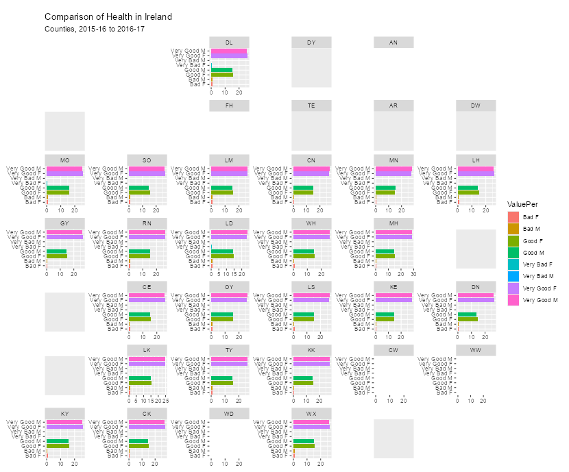
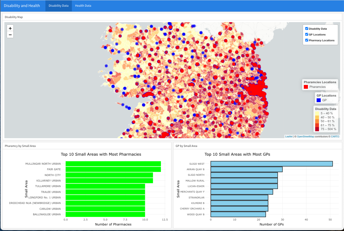
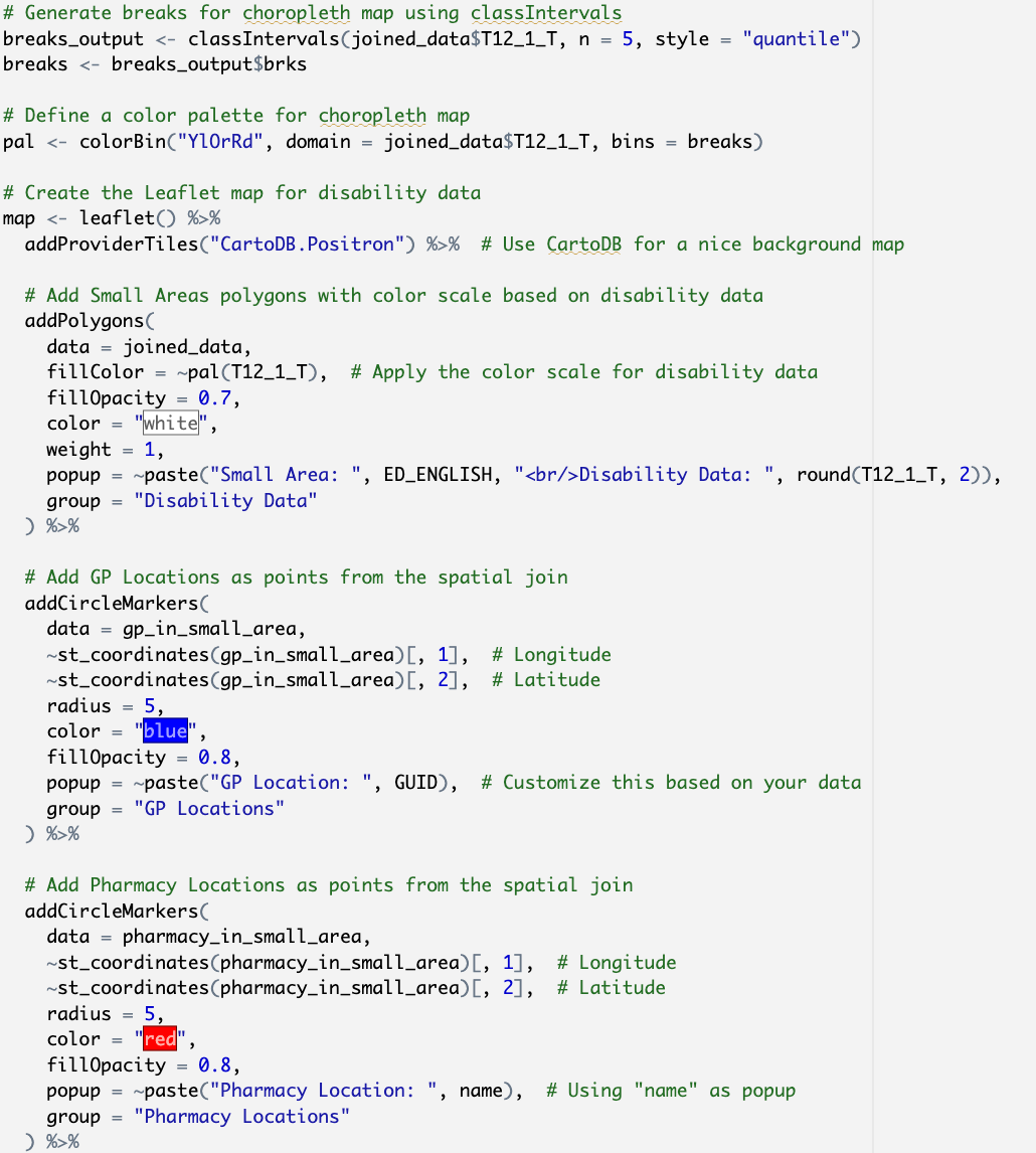
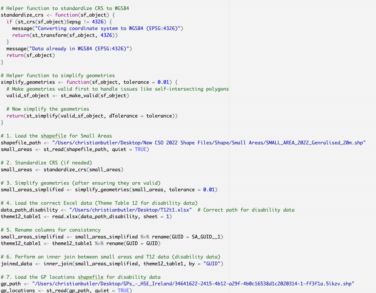
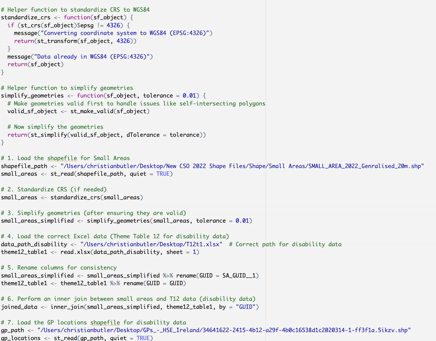
The project aimed to investigate the level of accessibility provision and disability throughout Ireland using spatial data analysis. This was conducted primarily through the creation of map charts using public data repositories. Users can gain insights on disability rates and health service provision at the small area level by interacting with a dashboard developed using the open source environment R. The project also used proprietary technologies such as Tableau together with R libraries specialising in spatial and data visualisation e.g. ggplot2, leaflet, mapview and flexdashboard.
We started with creating a simple map in the propertiety data visualisation software called Tableau. This allowed to explore and learn about the world of spatial data and language
Here we have a data dashboard with spatial map and two filters. The project focused around spatial data analysis and the R enviornment creating a dashboard to visualise our data.
Here, we have a spatial heat map displaying the level of disability within Cork City. GP's and pharamcies are plotted as points.
The above spatial heatmap was developed in the R language environment. The code snipped demonstrates the development of loading and processing our mapping and data files
Continued onward from the above code example. Here we are generating a spatial heat map with the R package called leaflet with our processed data files.
Further on, we developed this chart to show the amount of GP's per Small Area. Additionally, this also aimed to show the correlation between access to essential services and better outcomes for those with disabilities
The above chart to display the amount of GP's was developed using this code snippet. The data and mapping files were developed similarily to the spatial map. However, a package called ggplot2 was used to create the charts.
Additionally, we also created a chart to illustrate the number of pharamcies per neighbourhood. Similarily to the GP chart, we aimed to show the connection between access to services and accessibility provision.
Here's the code example for how the pharamcy chart was developed. The chart used the same package as the GP chart
Thesis: Investigation of Accessibility Provision in Urban Environments through Spatial Data Analysis
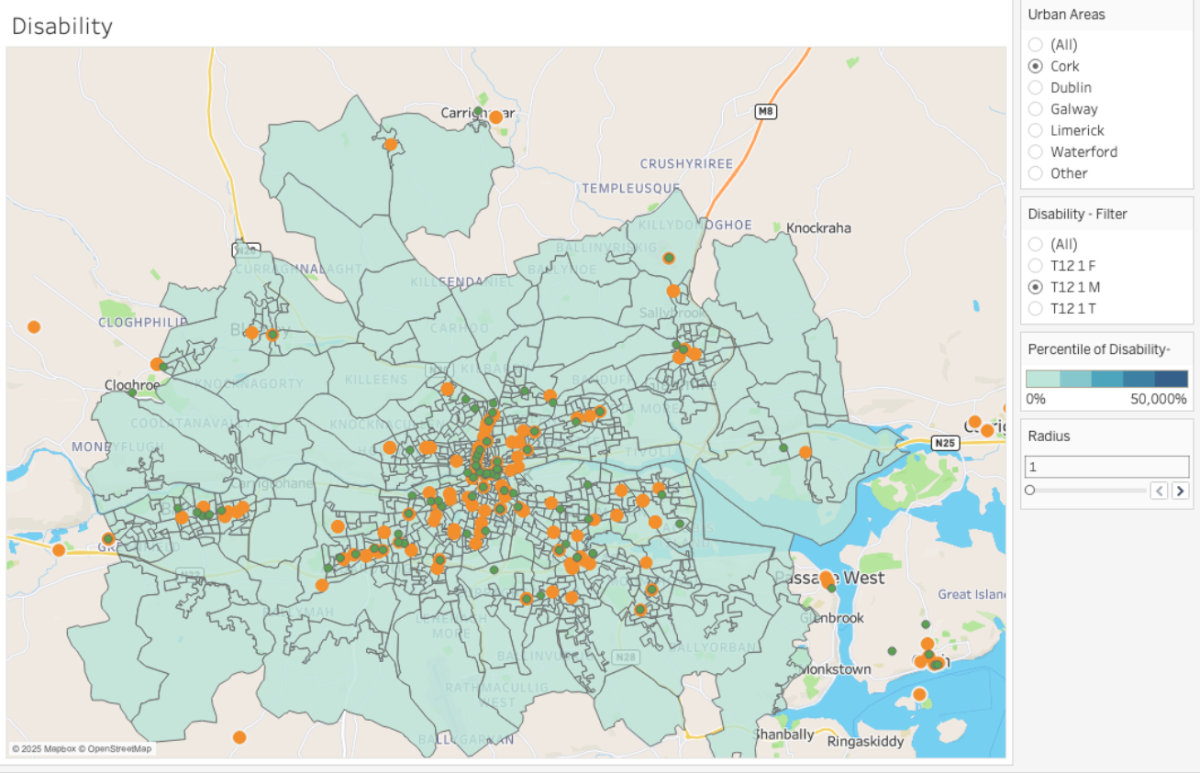
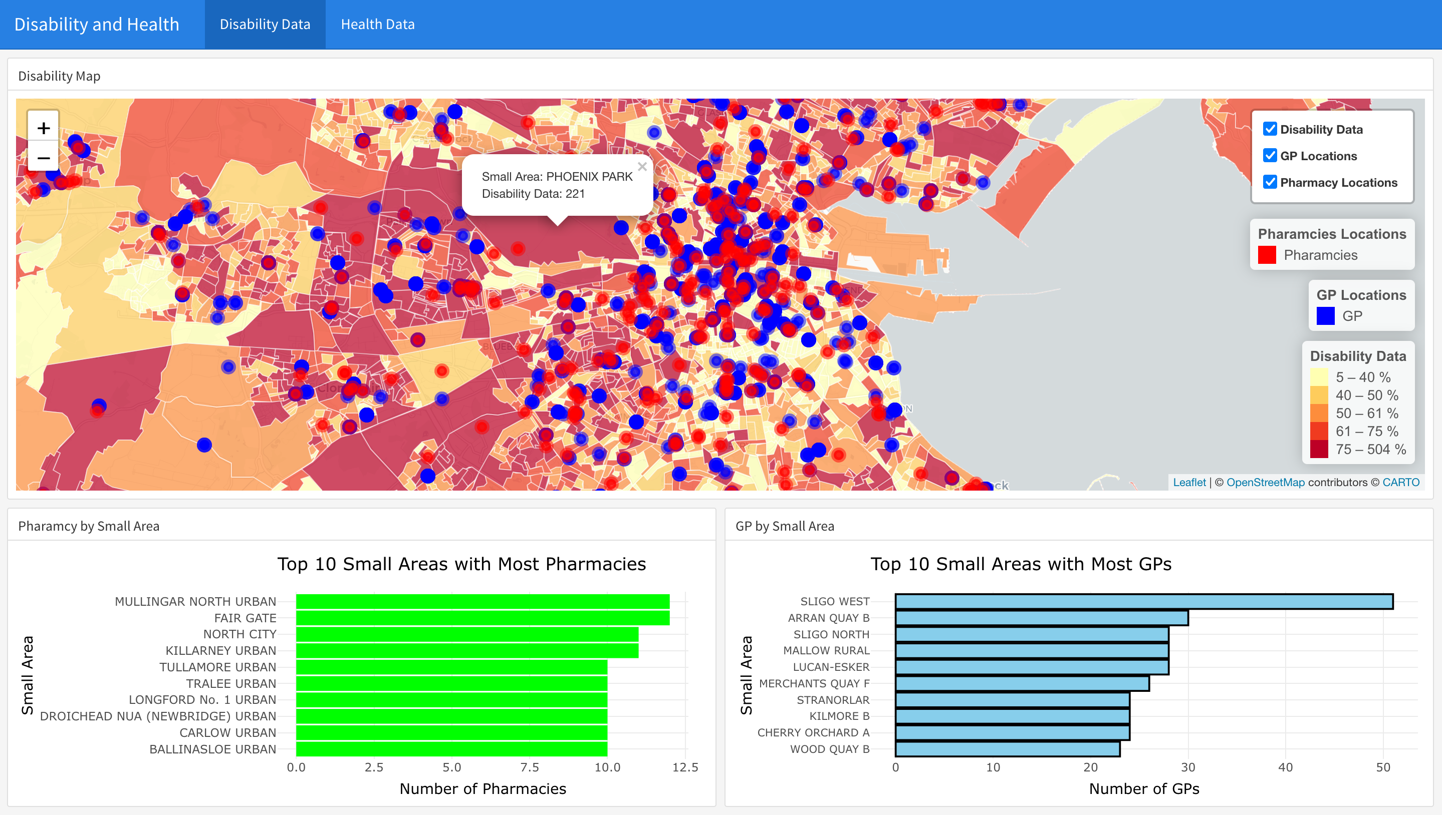
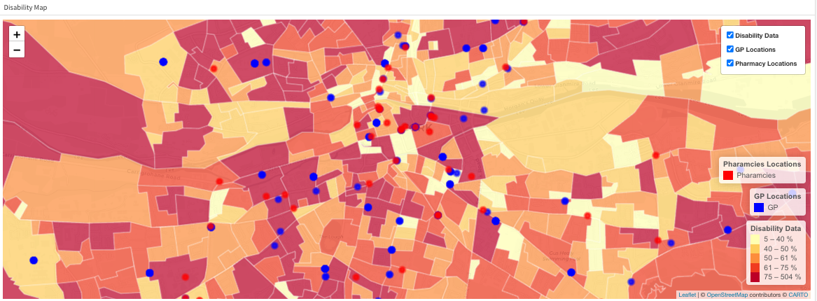
This document contains research and investigates accessibility provision in urban environments using spatial data analysis and other analytical methods. The project was developed using spatial data and data visualization technologies such as the proprietary Tableau software and the open-source R language. The findings established that spatial analysis is a useful tool for identifying accessibility provision within urban environments.
Christian Butler
BSc (Hons) Creative Computing
Hi, I'm Christian Butler. I'm a final year Creative Computing with a forward passion for Front End Development, Mobile Development and Data Visualisation
BSc (Hons) Creative Computing