- Aaron Mortell aaron-mortell-2
- Aaron Saula Design Thinking User Experience aaron-saula-2
- Adam Meaney adam-meaney-2
- Ailish Power Diversity Education Equality Psychology Research ailish-power-2
- Ailo James Kerr Film Lighting Design Television ailo-kerr-2
- Aisling Heade Psychology aisling-heade-2
- Aisling Keogh aisling-keogh-2
- Aisling Wallace Character Design Fashion Film History aisling-wallace-2
- Alanna Søpler Data Visualisation Transport + Travel alanna-soepler-2
- Alannah Mc Quaid Film Television alannah-mc-quaid-2
- Alex Ducie alex-ducie-2
- Alex Hughes AI Data Visualisation Engineering Ethics Future Technologies Healthcare Research Science alex-hughes-2
- Alexander Cokyna Drawing alexander-cokyna-2
- Alexander Lappin Mackay Character Design Fashion alexander-lappin-mackay-2
- Alicia McManus Drawing Film alicia-mc-manus-2
- Alison Jones Branding Business Music alison-jones-2
- Amy McFarland Film amy-mc-farland-2
- Amy Wiseman Psychology amy-wiseman-2
- Anamarija Kuran Cultural Diversity Psychology Research Science anamarija-kuran-2
- Anastasia Ovchinnikova History Research anastasia-ovchinnikova-2
- Andrea Parra App Branding Digital Design Healthcare Illustration Motion Graphics Psychology User Experience Website andrea-parra-rada-2
- Andrei-Gabriel Spiridon Psychology andrei-gabriel-spiridon-2
- Andrew McCarthy Cybersecurity Psychology andrew-mccarthy-2
- Angela Murray 3D Architecture Character Design Design Thinking History Painting Performance Product Design Sculpture angela-murray-2
- Anika O'Hagan-Ploug 3D Digital Design Diversity Drawing Film Set Design anika-o-hagan-ploug-2
- Anita Savic App Branding Cultural Design for Change Design Thinking Digital Design Diversity Environment Equality Family Healthcare Illustration User Experience anita-savic-2
- Anne-Marie McAleenan Set Design anne-marie-mc-aleenan-2
- Annie Browne Drawing Film Illustration Music Website annie-browne-2
- Anthea Ring Character Design Digital Design Drawing Film Illustration Motion Graphics Research Television Website anthea-ring-2
- Anthony Harte 3D Digital Design Exhibition Design Game Design anthony-harte-2
- Aoife Bullock Game Design Installation Sculpture Wildlife aoife-bullock-2
- Aoife O'Byrne Character Design Drawing Film Illustration Sculpture Set Design aoife-o-byrne-2
- Aoife Sherlock Design for Change Design Thinking Digital Design Fashion Print Making Product Design Website aoife-sherlock-2
- Aoife Shorten 3D Digital Design Film Sculpture aoife-shorten-2
- Arann Mc Cormack arann-mc-cormack-2
- Noreen Buzenschi Drawing Film Illustration Television ashley-buzenschi-2
- Ava O Donohoe Installation ava-o-donohoe-2
- Aveen Mc Kernan 3D Installation Sculpture aveen-mc-kernan-2
- Bella Quinn Character Design Drawing Illustration Painting bella-quinn-2
- Benedit Akemba Covid-19 Cultural Diversity Education Equality Fashion benedit-akemba-2
- Blaíthín Ring 3D Installation Sculpture blaithin-ring-2
- Bobbi Downer Psychology Science bobbi-downer-2
- Bodb Redden Character Design Drawing Illustration bodb-redden-2
- Bozena Jaslan Psychology Research Science bozena-jaslan-2
- Brad Hennessy Music Psychology Research brad-hennessy-2
- Caitlin Hennessy Education Life Sciences caitlin-hennessy-2
- Caleb Brock Psychology Research caleb-brock-2
- Callum O Higgins Character Design Film Television callum-o-higgins-2
- Camille Peat 3D Installation Sculpture camille-peat-2
- Caoimhe Farrell Painting caoimhe-farrell-2
- Carla Fancello Accessibility AI Ethics Future Technologies Psychology Research Science carla-fancello-2
- Carol Jordan Performance Psychology Sculpture Social Justice carol-jordan-2
- Cathal Coughlan User Experience cathal-coughlan-2
- Kate Minogue Illustration catherine-minogue-2
- Charles Danneels Film Music Television charles-danneels-2
- Chris Dent Psychology chris-dent-2
- Chris Byrne Film Music User Experience Website christopher-byrne-2
- Cian Brennan Film Lighting Design Television cian-brennan-2
- Cian Fagan Future Technologies Music Performance cian-fagan-2
- Cian Mooney Psychology cian-mooney-2
- Cian O'Malley Film cian-o-malley-2
- Ciara Dixon Psychology ciara-dixon-2
- Ciara Jennings 3D Character Design Digital Design Drawing Game Design Motion Graphics Sculpture Set Design ciara-jennings-2
- Ciarán Ward Crime Psychology Research ciaran-ward-2
- Claire Long Book Branding Design for Change Design Thinking Environment Ethics Motion Graphics Politics Protest Research Social Justice claire-long-2
- Clarabelle Murphy Book clarabelle-murphy-2
- Clíona Ball Television cliona-ball-2
- Clóda O Loughlin Design Thinking Digital Design Product Design User Experience cloda-o-loughlin-2
- Clodagh Walsh Branding Education Illustration Website clodagh-walsh-2
- Colm Delaney AI App Digital Design Education Entrepreneurship Future Technologies Music colm-delaney-2
- Conor Clear Keena Music conor-clear-keena-2
- Conor Cronin Ethics Future Technologies Game Design Psychology conor-cronin-2
- Conor Larkin Film Music Radio Television conor-larkin-2
- Conor Leavy Fashion Film Music conor-leavy-2
- Conor Morgan Cultural Music Performance Psychology Research Science conor-morgan-2
- Cori Doherty Education Film cormac-doherty-2
- Cormac Lalor Psychology cormac-lalor-2
- Cormac Robinson Psychology cormac-robinson-2
- Cristina McEvoy Duque Character Design Digital Design Drawing Film Television cristina-mc-evoy-2
- Csilla Torok csilla-torok-2
- Cúan Ó Nualláin Music cuan-o-nuallain-2
- Daniel Clarke Psychology daniel-clarke-2
- Daniel Lloyd Psychology daniel-lloyd-2
- Daniel Sedgwick Film daniel-sedgwick-2
- Dara McManus Film Television dara-mc-manus-2
- David Doyle Character Design Drawing Film Illustration Motion Graphics david-doyle-2
- Davy Hudson Tyrrell Film davy-hudson-tyrrell-2
- Denise Greene Psychology denise-greene-2
- Desmond Finn Cybersecurity Psychology desmond-finn-2
- Diarmuid Fanning Psychology diarmuid-fanning-2
- Domhnall Cotter Film domhnall-cotter-2
- Eilis McLoughlin Painting eilis-mc-loughlin-2
- Em Mc Loughlin Design Thinking Fashion Film Research eimear-mc-loughlin-2
- El Eileen Brady Film Television el-e-brady-2
- Elijah Fleming Psychology elijah-fleming-2
- Eliza Królikowska eliza-krolikowska-2
- Ella Sexton Environment Life Sciences Print Making Science ella-sexton-2
- Ellen Clifford Environment Film Research Wildlife ellen-clifford-2
- Ellie Flannery Branding Design Thinking Illustration ellie-flannery-2
- Ema Devcic App Design Thinking Digital Design Product Design User Experience ema-devcic-2
- Emily McQuillan Psychology emily-mc-quillan-2
- Emily Ryan Film emily-ryan-2
- Emma Feerick Accessibility Diversity Psychology Research Science emma-feerick-2
- Emma Tarpey 3D Film Painting emma-tarpey-2
- Eoghan Keane Film Television eoghan-keane-2
- Etaoin Corcoran AI Future Technologies Psychology etaoin-corcoran-2
- Ethan Dodd Film Television ethan-dodd-2
- Eugene McAteer Character Design Film Music Performance Sculpture Set Design eugene-mc-ateer-2
- Eva Kavanagh 3D Character Design Film Sculpture Set Design eva-kavanagh-2
- Eva Mahon Design Thinking Drawing Fashion Film History eva-mahon-2
- Evan Tobin evan-tobin-2
- Evanna Devine Cultural Education Installation evanna-devine-2
- Faye Azure Hughes Exhibition Design Film Installation Performance Sculpture faye-hughes-2
- Fernanda Alves AI Design Thinking User Experience fernanda-fonseca-dos-santos-alves-2
- Fiachra Donovan 3D Character Design Illustration Product Design Sculpture fiachra-donovan-2
- Finbar Flanagan Cultural Ethics Family Installation Print Making finbar-flanagan-2
- Finnán Connolly O'Sullivan Game Design Psychology Research Science finnan-connolly-o-sullivan-2
- Fionn McArdle Advertising Book Branding Design for Change Design Thinking Digital Design Exhibition Design Installation Motion Graphics Print Making fionn-mc-ardle-2
- Gabriela Cladellas Data Visualisation Design for Change Design Thinking Research gabriela-cladellas-2
- Gabriella Cannon gabriella-cannon-2
- Garrett Kavanagh 3D Architecture Film Television garrett-kavanagh-2
- Gavin Phelan 3D Character Design Environment Game Design gavin-phelan-2
- Georgia Giffin Character Design Drawing Energy Environment Motion Graphics Performance georgia-giffin-2
- Giovanni O Halloran Data Visualisation Design for Change Education Installation Motion Graphics Music Politics Sculpture User Experience giovanni-o-halloran-2
- Guia Macapaz Character Design Film Television guia-macapaz-2
- Hana Mohamed Film hana-mohamed-nasr-el-din-2
- Hanna Oska Psychology hanna-oska-2
- Hannah Gruebsch Psychology hannah-butler-gruebsch-2
- Hannah Jones Architecture Cultural Design for Change Energy Environment History Installation Life Sciences Property Research Science Sculpture Wildlife hannah-jones-2
- Hannah Owens Music Psychology Research hannah-owens-2
- Heitor Laforga Cultural Design for Change History Research Social Justice heitor-laforga-de-araujo-monteiro-2
- Henry Downes 3D Character Design Drawing Film Illustration henry-downes-2
- Holly Urwin Environment Psychology Research Science holly-urwin-2
- Holly White Fashion holly-white-2
- Isobel Lord Character Design Digital Design Drawing Fashion Film Set Design isobel-lord-2
- Iza Jane Geraghty Installation iza-jane-geraghty
- Jack Burton Psychology jack-burton-2
- Jaka Jože Prosenik Film Television jaka-prosenik-2
- Jake Lombard Psychology jake-lombard-2
- Jakob Lemme 3D Film Television jakob-lemme-2
- James Curran Architecture Book Branding Exhibition Design james-adye-curran-2
- James Grant Duggan Architecture Digital Design Drawing Exhibition Design Film Illustration Painting Set Design Television james-grant-duggan-2
- James Murray Film Music Television james-murray-2
- Jamie Howard Cultural Design for Change Environment Ethics History Painting Politics Protest Psychology Sculpture Social Justice jamie-howard-2
- Jamie Lee Ayeva Diversity Equality Psychology Social Justice jamie-lee-ayeva-2
- Jan Mara Accessibility Advertising AI App Branding Cultural Design for Change Design Thinking Digital Design Diversity Family Future Technologies History Research User Experience jan-mara-2
- Jane Prendergast Drawing Painting jane-prendergast-2
- Jennifer Alken Psychology jennifer-alken-2
- Jennifer Reynolds Environment Wildlife jennifer-reynolds-2
- Jessica Lyons Film Television jessica-lyons-2
- Joanna Kiszka Installation Sculpture joanna-kiszka-2
- Joey Chong Design Thinking joey-chong-2
- John Carey Character Design john-carey-2
- Jordan Morris 3D jordan-morris-2
- Jordon Kelly Cybersecurity Politics Psychology Research jordon-kelly-2
- Joseph Eustace Psychology Sports + Fitness joseph-eustace-2
- Joy Mora Illustration Painting joy-mora-2
- Jude Quilty Cultural Education History User Experience jude-quilty-2
- Julia Wysocka Film julia-wysocka-2
- Juliette Byrne Psychology juliette-byrne-2
- Kacper Jaroszynski Design Thinking Motion Graphics Product Design User Experience kacper-jaroszynski-2
- Kane Finnie Cultural Music Psychology Research kane-finnie-2
- Karen Harper 3D Accessibility Architecture Branding Design for Change Design Thinking Digital Design Education Entrepreneurship Print Making User Experience karen-harper-2
- Katarina Spelicova Character Design Film katarina-spelicova-2
- Kate O Driscoll Management Music Performance Research kate-o-driscoll-2
- Katie Macey Advertising App Branding Illustration katie-macey-2
- Kaitlyn Jinks Architecture Design Thinking Exhibition Design Film Painting Set Design Television katlyn-jinks-2
- Keelin Kusch keelin-kusch-2
- Kenji Dasal 3D Game Design kenji-dasal-2
- Killian O'Boyle Covid-19 Ethics Film Game Design Music killian-o-boyle-2
- Kitija Salmina kitija-salmina-2
- Kittitat Bamrung AI App Data Visualisation Education Future Technologies Music Research User Experience kittitat-bamrung-2
- Klara Gyarmathy Accessibility Product Design Psychology Research klara-gyarmathy-2
- Kyle Hamilton Environment Exhibition Design Film Property Sculpture Television Wildlife kyle-hamilton-2
- Kyle O Neill Music kyle-o-neill-2
- Kym O Neill 3D Character Design Covid-19 Digital Design Drawing Exhibition Design Film Illustration Installation Lighting Design Performance Sculpture kym-o-neill-2
- Laoise Broderick Psychology laoise-broderick-2
- Laura Clarke Environment Installation Painting laura-clarke-2
- Laura Mahon laura-mahon-2
- Laura Roman Crime Cybersecurity Psychology laura-roman-2
- Laura Tolis App Digital Design User Experience Wildlife laura-tolis-2
- Lauren Divilly Environment Fashion Psychology lauren-divilly-2
- Lavender Jane Gartlan Character Design Fashion Performance Set Design lavender-gartlan-2
- Lavinia De Vito Film lavinia-de-vito-2
- Leah McConnell Psychology leah-mc-connell-2
- Lee Brady Music lee-brady-2
- Leo O' Rourke Psychology leo-o-rourke-2
- Liam Bedford App Data Visualisation User Experience liam-bedford-2
- Lillian Boylan lillian-boylan-2
- Lily King Psychology lillian-king-2
- Lorraine Ene Painting Sculpture lorraine-ene-2
- Louise Barry Psychology louise-barry-2
- Luca Ambrogioni 3D Advertising Branding Design for Change Design Thinking Digital Design Environment Motion Graphics Science Wildlife luca-ambrogioni-2
- Lucille Carolan Film lucille-carolan-2
- Lucy Kenneally Psychology lucy-kenneally-2
- Luke Coogan Design for Change Digital Design User Experience luke-coogan-2
- Luke Doyle Set Design luke-doyle-2
- Luke O'Reilly Branding Design for Change Design Thinking Diversity Website luke-o-reilly-2
- Madison Pitout 3D Character Design Film Sculpture madison-pitout-2
- Maeve Kimmage Design for Change maeve-kimmage-2
- Maggie Mroczek 3D App Character Design Family Transport + Travel User Experience magdalena-mroczek-2
- Maiya Rice Film maiya-rice-2
- Malachy Sammon Music Painting Research malachy-sammon-2
- Mark Butler AI Branding Business Design for Change Ethics Future Technologies Music Research mark-butler-2
- Mark Lynch Film mark-lynch-2
- Marks Adomaitis Music Psychology Research marks-adomaitis-2
- Mary Nangle Psychology mary-nangle-2
- Mateusz Bukowski Music Psychology mateusz-bukowski-2
- Mathews De Leon 3D Drawing Film Sculpture Television mathews-de-leon-2
- Matt McDonnell Research Science matthew-mc-donnell-2
- Matthew Ryan Advertising Branding Design Thinking Digital Design Film Future Technologies Motion Graphics Product Design Television Website matthew-ryan-2
- Max Mori Bley 3D Character Design Fashion Film Painting Sculpture Set Design max-bley-2
- Meabh Moylan Advertising Branding Design Thinking Illustration meabh-moylan-2
- Meabh O Looney Psychology meabh-o-looney-2
- Meabh Reid meabh-reid-2
- Meadbh Hanley Character Design meadbh-hanley-2
- Megan Bass Drawing Illustration Life Sciences megan-bass-2
- Michael Brennan Cultural Digital Design Film Music michael-brennan-2
- Michelle Saal Character Design Drawing Film Illustration michelle-brehhova-2
- Michelle Higgins michelle-higgins-2
- Michelle Mc Geown 3D Environment Installation Sculpture michelle-mc-geown-2
- Mo Sung Du Music mo-du-2
- Moira-Rose Kennedy Drawing Film Set Design moira-rose-kennedy-2
- Molly Doyle Cultural Family Film History Music Research molly-doyle-2
- Moritz Kramer Film moritz-kramer-2
- Moya Woods moya-woods-2
- Muireann O'Donohoe Psychology muireann-o-donohoe-2
- Naoise Ahearne Woods Film naoise-ahearne-woods-2
- Nathan Moore Transport + Travel User Experience Website nathan-moore-2
- Niah Donnelly Music niah-donnelly-2
- Niamh Blennerhassett Cultural Psychology Research Social Justice niamh-blennerhassett-2
- Niamh Crean Branding Design for Change Design Thinking Social Justice niamh-crean-2
- Niamh Mahon Digital Design Drawing Film Illustration Motion Graphics Painting Television niamh-mahon-2
- Niamh Whelan Psychology niamh-whelan-2
- Nick Willoughby Film nick-willoughby-2
- Nicoleta Jingan Psychology Research User Experience nicoleta-jingan-2
- Nikkita Cowman 3D nikkita-cowman-2
- Noemi Fulop 3D Architecture Character Design Digital Design Exhibition Design Installation Painting Sculpture Set Design Television noemi-fulop-2
- Oisin McKeogh Film oisin-mc-keogh-2
- Oisín O'Sullivan 3D Architecture Digital Design Education Game Design oisin-o-sullivan-2
- Okhaide Itua Painting okhaide-itua-2
- Oleksandr Mustakaiev AI App Product Design User Experience Website oleksandr-mustakaiev-2
- Orla Reynolds Equality Psychology Research orla-reynolds-2
- Oscar Freaney Film oscar-freaney-2
- Owen Moore Cultural Music Psychology Research owen-moore-2
- Paola Iacovone Painting paola-iacovone-2
- Patrick Bondaruk AI App Design Thinking Digital Design Life Sciences Motion Graphics Performance Product Design Research User Experience patrick-bondaruk-2
- Patrick Kellegher Cultural patrick-kellegher-2
- Pearse McKiernan Advertising Environment Ethics Family Film History Motion Graphics Music Politics Radio Television pearse-mc-kiernan-2
- Penny Crowther Music penny-crowther-2
- Rebecca Helena Mc Connon Drawing Fashion Film rebecca-mc-connon-2
- Rebecca Wise Character Design rebecca-wise-2
- Reese Carroll Film reese-carroll-2
- Regina Rochford Psychology regina-rochford-2
- Richard Byrne richard-byrne-2
- Richard Stone 3D Installation Sculpture richard-stone-2
- Robert Carrie Music robert-carrie-2
- Robert Moran Design Thinking Future Technologies Product Design Research User Experience robert-moran-2
- Roisin Lambert roisin-lambert-2
- Róisín Mc Grath Advertising Branding Cultural Design for Change Design Thinking Digital Design Environment Ethics Exhibition Design Installation Motion Graphics Performance Set Design User Experience Website roisin-mc-grath-2
- Rory Foster Book Branding Cultural Design for Change Design Thinking Motion Graphics rory-foster-2
- Ross Bradley Drawing ross-bradley-2
- Ruairi Bradley Film ruairi-bradley-2
- Ruairi O Sullivan Psychology ruairi-o-sullivan-2
- Ruby Mc Evoy ruby-mc-evoy-2
- Ruth Byrne Psychology Television ruth-byrne-2
- Ryan Egan 3D Digital Design Film Installation Sculpture ryan-egan-2
- Samuel Shepard 3D Film samuel-shepard-2
- Saoirse O'hUadhaigh 3D Character Design Cultural Film saoirse-o-huadhaigh-2
- Saorlaith Kelly Book Cultural Film saorlaith-kelly-2
- Sarah Fanning Covid-19 Education Ethics Healthcare Life Sciences Psychology Research sarah-fanning-2
- Sean Cassidy Game Design Music sean-cassidy-2
- Seán Cotter Accessibility Advertising Branding Design for Change Design Thinking Motion Graphics Print Making sean-cotter-2
- Sean Farrell Painting sean-farrell-2
- Sean O Boyle sean-o-boyle-2
- Shaena Trotman 3D AI Future Technologies Research shaena-trotman-2
- Shannon O Hagan 3D Character Design Digital Design Sculpture shannon-o-hagan-2
- Shauna Cooke Character Design shauna-cooke-2
- Shauna Dowdall Character Design shauna-dowdall-2
- Shona Duffy Character Design shona-duffy-2
- Sophie Lynch Film sophie-lynch-2
- Sorcha Carrigan Character Design sorcha-carrigan-2
- Stephen Gordon App Finance Future Technologies User Experience stephen-gordon-2
- Steven Kennedy Music Research steven-kennedy-2
- Susanna Gibbs 3D Character Design Digital Design Game Design susanna-gibbs-2
- Sydney Levene Film Music Psychology sydney-levene-2
- Tadhg De Freine Accessibility Book tadhg-de-freine-2
- Tadhg O'Reilly McCann Character Design Design Thinking Drawing Film Game Design History Illustration Sculpture Set Design tadhg-mc-cann-2
- Tadhg O'Shea Character Design Drawing Film tadhg-o-shea-2
- Tamara Markey Design for Change Equality Research Social Justice tamara-markey-2
- Tania Stokes tania-stokes-2
- Tariq Horan Digital Design Engineering Product Design Research User Experience Website tariq-horan-2
- Tatiana Kozar Digital Design Drawing Film tatiana-kozar-2
- Teo Cursaru Film teo-cursaru
- Tess Doolan Burke Film tess-doolan-burke-2
- Thomas English Character Design Drawing Film Illustration Television thomas-english-2
- Tommy Finn Film Radio Television tommy-finn-2
- Tuesday Medea Conroy Design Thinking Digital Design tuesday-conroy-2
- Vanda Brown 3D Environment Installation Painting Sculpture Social Justice vanda-brown-2
- Vas Zafeiri Digital Design vasiliki-zafeiri-2
- Veronika Zelentsova 3D Character Design Film veronika-zelentsova-2
- Wren Petkov wren-petkov-2
- Yuriy Hlopok yuriy-hlopok-2
- Yvonne McElroy Drawing Film Illustration yvonne-mc-elroy-2
- Zach Drew 3D Character Design Drawing Film Illustration Painting Television zach-drew-2
- Zach Ryan Cultural Psychology Research zach-ryan-2
- Zai Froggatt zai-froggatt-2
- Zara Hering 3D Sculpture zara-hering-2
- Zara Hitchen Sports + Fitness zara-hitchen-2
- 3D Animation
- 3D Design Modelmaking + Digital Art
- Animation
- Applied Psychology
- Art
- Character MakeUp Design
- Costume Design
- Creative Computing
- Creative Music Production
- Cyberpsychology
- Design for Change
- Film + Television Production
- Interaction + User Experience Design
- New Media Studies
- Photography
- Production Design
- User Experience Design
- Visual Communication Design
- Home Homepage Index Overview
Karen Harper
Concept design, purposeful creations, humour and quirky ideas, are all the things that make me spark. A long time coming as I was interested in studying graphic design when I was 21. Thankfully I took all my other life experience with me and had 4 great years of learning. With the year of the photography degree under my belt first, it was a great skill to have in my back pocket. Coding was where I thought I would give up but instead it was something I thrived at. ~Being dyslexic I enjoy the big picture problems, innovation, and problem solving, by seeing the whole problem and simplifying it. If you are not having fun you are not doing it right!


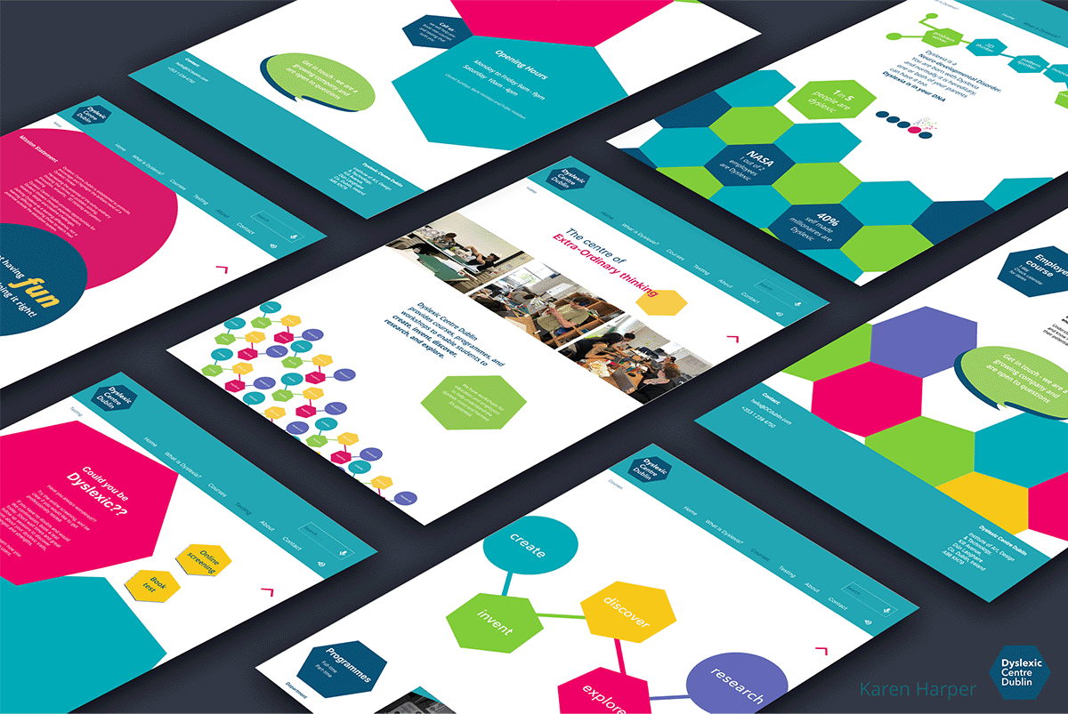
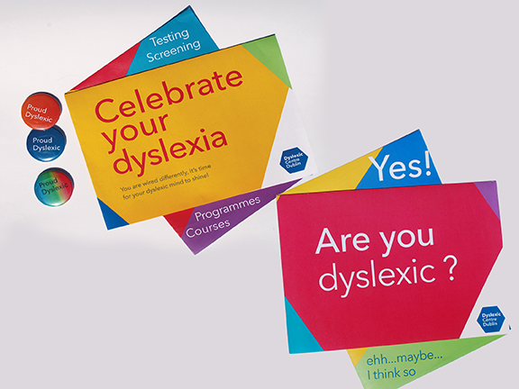
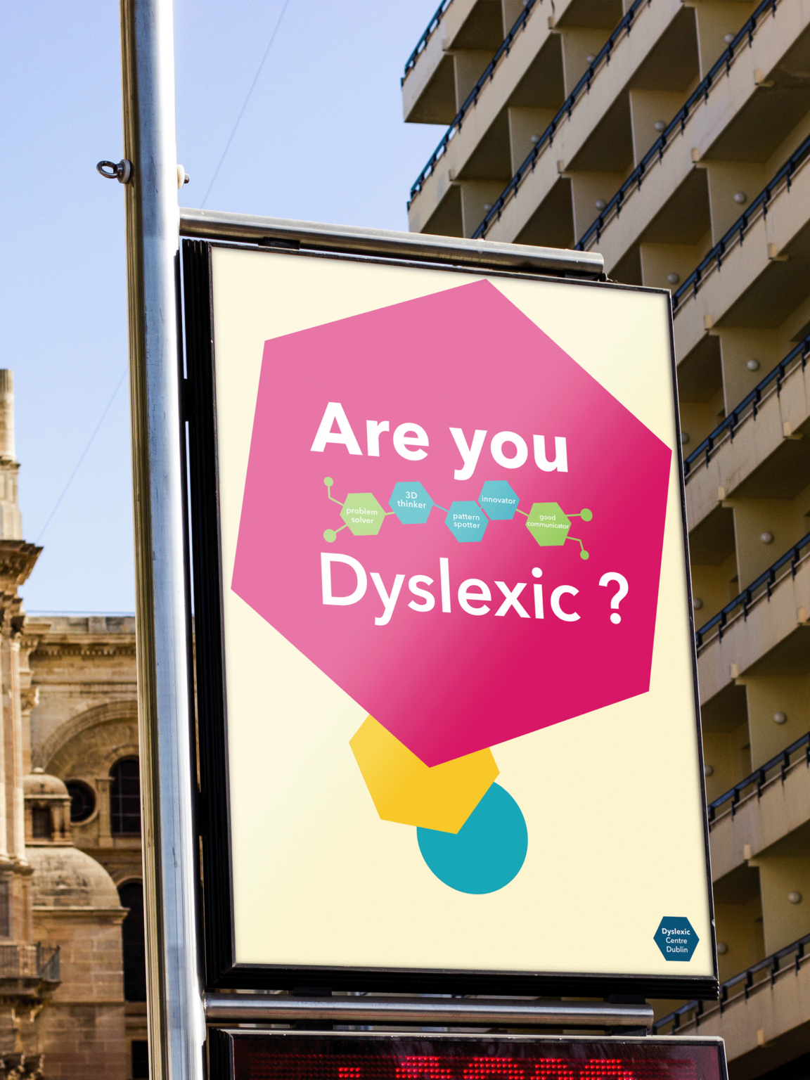
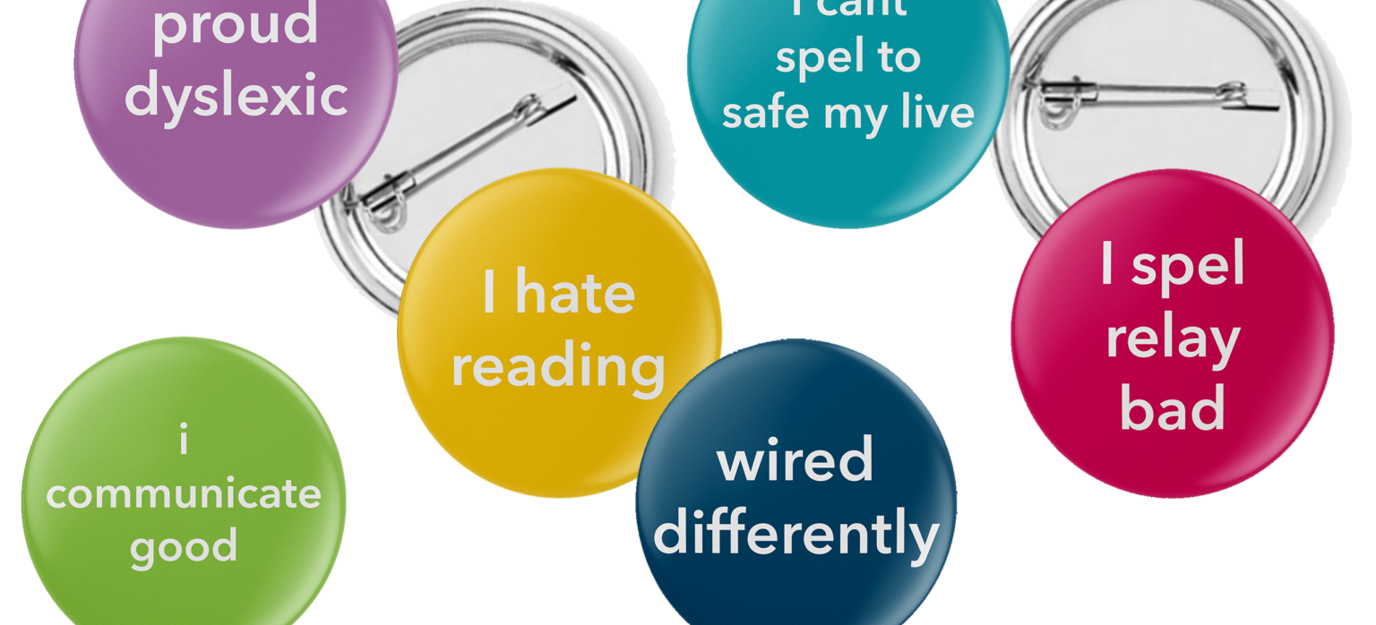
A centre for all things Dyslexic. Programmes, courses and workshops for dyslexics to stretch those amazing brains, workshops for educators so they can recognise dyslexic traits, and workshops for employers so they can harness the extra-ordinary thinking of their dyslexic employees. Each page is different within the same theme for dyslexics to have reference points to find their way around and be able to get back to that part easily. Photos of testing staff, images of students working and images to represent the courses gives insight so the person is familiar with what is ahead. Everyone starts with a workshop to 'learn how you learn', which will make life so much easier for them going forward. Self awareness of your strengths gives you the power to reach your potential.
Sexy Chocolate: An examination of how Green and Black’s singled out a sophisticated adult audience with their ‘This is not a chocolate bar’ series.
‘This is not a chocolate bar’ is a series of six adverts from 2013, by Green and Black’s confectionery company. The company employed Mother Design in London, to design this series of adverts with a cheeky new direction in branding. With that in mind, the design company used semiotics, surrealism, and clever language to produce six adverts that incorporated the chocolate bars being anthropomorphised, including some sexual referencing and clever play on objects to make a memorable ad campaign, that stood out and further solidified their position as a luxury confectionery company. The thesis examined how Green and Black’s singled out a sophisticated adult audience and how they aimed their advertising campaign at them.
- Tadhg De Freine
- Niamh Crean
- Seán Cotter
- Joey Chong
- Luca Ambrogioni
- James Curran
- Clodagh Walsh
- Evan Tobin
- Aoife Sherlock
- Anita Savic
- Matthew Ryan
- Jude Quilty
- Andrea Parra
- Luke O'Reilly
- Maggie Mroczek
- Meabh Moylan
- Róisín Mc Grath
- Fionn McArdle
- Katie Macey
- Claire Long
- Maeve Kimmage
- Karen Harper
- Rory Foster
- Ellie Flannery
- Alex Ducie
