- Aaron Kavanagh Education Film aaron-kavanagh
- Aaron Lynch 3D App Future Technologies Game Design Music aaron-lynch
- Aaron Moloney Energy Ethics Film Music Performance Psychology aaron-moloney
- Abbie Rea Research abbie-e-rea
- Adam D. Kelly Engineering Transport + Travel adam-d-kelly
- Adam Nolan Advertising App Architecture Branding Cultural Design for Change Design Thinking Digital Design Drawing Education Environment Exhibition Design Government History Illustration Motion Graphics Painting Politics Product Design Protest Research Social Justice User Experience Website adam-nolan
- Aidan O Toole App Game Design aidan-o-toole
- Ailish Phillips App Branding Design for Change Design Thinking Digital Design User Experience ailish-phillips
- Aisling Brophy aisling-brophy
- Aisling Kelly-Brophy 3D Game Design User Experience aisling-kelly-brophy
- Alanna Drury Accessibility App Branding Cultural Design for Change Design Thinking Digital Design Exhibition Design Family History User Experience alanna-drury
- Alanta Grigaliunaite 3D alanta-grigaliunaite
- Aleksandra Z Koleva Drawing Film Illustration Music Painting aleksandra-z-koleva
- Alessia Merkes Psychology alessia-merkes
- Alison Deegan Cybersecurity Psychology Research User Experience Website alison-deegan
- Alison Farrell 3D Healthcare alison-farrell
- Alix Bent Environment alix-bent
- Amy D’Agostini Branding Character Design Design Thinking Digital Design Motion Graphics Product Design User Experience Website amy-d-agostini
- Amy Lee Benton Byrne Psychology amy-l-benton-byrne
- Amy O'Reilly Film amy-o-reilly
- Ana Dodon Book Character Design Digital Design Drawing Film Illustration Painting ana-dodon
- Ana Paula N. Borges Cultural Diversity Life Sciences Psychology Research Science ana-p-neres-borges
- Anca-Ioana Avasilichioaiei 3D Character Design Cultural Digital Design Game Design Set Design anca-i-avasilichioaiei
- Andrea Farrelly Accessibility Covid-19 Education Environment Future Technologies Psychology Research Science User Experience andrea-farrelly
- Angela Hegarty angela-hegarty
- Anna Larsson anna-larsson
- Anna Stuart Sculpture anna-stuart
- Aoibhe McCann Branding Design for Change Design Thinking Digital Design Illustration aoibhe-mc-cann
- Aoife Brennan Website aoife-brennan
- Aoife Flynn Fallon Diversity Equality Film Radio Television aoife-flynn-fallon
- Aoife Wims 3D Architecture Cultural Installation Sculpture aoife-wims
- Aran Hopkinson aran-j-hopkinson
- Armandas Bendaravicius Cultural Psychology armandas-bendaravicius
- Arthur Raven Hurley 3D Digital Design Game Design arthur-raven-hurley
- Aurelia Beving Cultural Diversity Education Exhibition Design aurelia-beving
- Ava Foster Education Film Music Performance ava-foster
- Avery Angle Digital Design Environment Film Illustration Lighting Design Painting avery-e-angle
- Ayesha Ahmad Installation Sculpture ayesha-ahmad
- Bebhinn Alexandra O’Reilly Character Design bebhinn-a-o-reilly
- Bianca Cojocariu Film bianca-cojocariu
- Blaise Robinson Film Television blaise-robinson
- Blanka Karaskova Character Design Covid-19 Healthcare Psychology blanka-karaskova
- Brian O Boyle 3D Drawing Film Illustration brian-o-boyle
- Bróna Nic Gabhann Character Design Film Illustration brona-nic-gabhann
- Bronwyn Leigh Smith bronwyn-smith
- Bruno Cassandro 3D Architecture Sculpture bruno-cassandro
- Callie Hardy Cultural Film Painting Research Social Justice callie-hardy
- Camille Lindlahr App Branding Design for Change Design Thinking Digital Design Education Ethics Family Healthcare Motion Graphics Research User Experience camille-lindlahr
- Caoimhe Cullen Fashion caoimhe-cullen
- Caoimhe Laverty Design Thinking Digital Design Film Performance caoimhe-laverty
- Caolán O’Hagan AI App Healthcare Science Website caolan-o-hagan
- Carlos Moguel Advertising Film Television carlos-moguel-macias
- Caroline Kiersey Branding Design Thinking Digital Design Drawing Illustration Product Design User Experience Website caroline-r-kiersey
- Catherine Feraday Miller 3D App Character Design Design for Change Drawing Education Environment Future Technologies Game Design Illustration Research Sculpture User Experience catherine-feraday-miller
- Cecilia Bonucci Advertising Book Branding Cultural Design for Change Education Ethics Print Making Research Website cecilia-bonucci
- Celine Harding celine-harding
- Chloe O'Connor Education Life Sciences Psychology Research Science chloe-g-o-connor
- Chloë Curtin 3D Architecture Exhibition Design History Installation Sculpture chloe-j-curtin
- Chloe Kennedy Design for Change Design Thinking Digital Design Diversity Energy Film Lighting Design Performance Psychology chloe-kennedy
- Chloe Cassidy chloe-m-cassidy
- Cian Butler Drawing Illustration Painting cian-butler
- Cian Gilmore 3D Advertising App Branding Digital Design Education Future Technologies Website cian-gilmore
- Cian Lawler Environment cian-lawler
- Cian McCarthy Film Music cian-mc-carthy
- Cian O'Carroll Film Research Sports + Fitness Television cian-o-carroll
- Cian O'Toole 3D Game Design cian-o-toole
- Cian O'Meara cian-p-o-meara
- Ciara Lawless ciara-lawless
- Ciara Little App Digital Design Psychology User Experience ciara-little
- Ciara McGowan Accessibility Advertising App Branding Design for Change User Experience ciara-mc-gowan
- Ciara McGrattan ciara-mc-grattan
- Ciaran Nally Psychology Research Science ciaran-nally
- Cillian Carroll 3D Advertising Branding Data Visualisation Design for Change Digital Design Environment Exhibition Design Future Technologies Illustration Motion Graphics Research User Experience Website cillian-carroll
- Clare O Brien AI Ethics Future Technologies Science Website clare-o-brien
- Clíona Gaffrey Moran Crime Psychology Science cliona-gaffrey-moran
- Clodagh McCarthy Design Thinking Digital Design Psychology Research User Experience clodagh-mc-carthy
- Colin Dunne Painting Psychology Sculpture colin-dunne
- Conor Bradley Film conor-bradley
- Conor Fitzsimons conor-fitzsimons
- Conor Lyons AI Future Technologies Research Website conor-lyons
- Conor Murphy AI Music conor-murphy
- Conor Ryan conor-ryan
- Craig Redmond App Finance Future Technologies User Experience craig-redmond
- Daniel Tynan 3D Design Thinking Education Exhibition Design History Installation Sculpture Set Design Wildlife daniel-j-tynan
- Daniel McCloskey App Design for Change Design Thinking Digital Design Future Technologies Product Design Psychology Research User Experience daniel-mc-closkey
- Daragh Lyons Character Design Film Illustration daragh-lyons
- Daria Arhipova Prokofjeva Cultural Film Politics daria-arhipova-prokofjeva
- Darin Bristow darin-bristow
- Darragh Black 3D App Branding Cybersecurity Data Visualisation Design for Change Design Thinking Digital Design Environment Future Technologies Motion Graphics Product Design Research User Experience darragh-black
- Darragh Kavanagh darragh-kavanagh
- David O'Hagan Psychology david-o-hagan
- David Shepstone 3D Film Music Performance david-shepstone
- Dawid Karczewski 3D AI App Data Visualisation Design for Change Design Thinking Digital Design Education Finance Product Design User Experience dawid-karczewski
- Dayna Brislane Branding Design for Change Design Thinking Digital Design Exhibition Design Illustration Motion Graphics User Experience Website dayna-brislane
- Dean Walsh dean-walsh
- Dearbhla Hanney 3D Sculpture dearbhla-hanney
- Denise O'Connell 3D Accessibility Covid-19 Cultural Diversity Education Environment Ethics Installation Sculpture Wildlife denise-o-connell
- Di McCay Wickman Character Design Drawing Film Illustration di-e-wickman
- Dominika M Haber Character Design Illustration dominika-m-haber
- Dora Krstulovic Psychology dora-krstulovic
- Eden Bryan Psychology eden-bryan
- Eileen Cahill Design for Change Design Thinking Research eileen-cahill
- Eimear Sullivan Character Design Drawing Family Illustration Motion Graphics eimear-sullivan
- Elena Mc Laughlin 3D Book Character Design Film Illustration Science Sculpture Set Design elena-mc-laughlin
- Elizabeth Chambers App Branding Design for Change Design Thinking Education Healthcare Illustration User Experience elizabeth-chambers
- Ella Brandt Film Illustration ella-brandt
- Ella Murphy Film ella-murphy
- Ellen Harper Burke Drawing Film Installation Painting ellen-harper-burke
- Ellen Harrold Book Exhibition Design Installation Painting ellen-harrold
- Ellen McGuirk Digital Design Film Website ellen-mc-guirk
- Emer Curran Covid-19 Psychology Research emer-curran
- Emilija Gostautaite Game Design Psychology Research Science emilija-gostautaite
- Emi Daly Branding Design Thinking Environment Motion Graphics Product Design emily-daly
- Emily McGee Film emily-k-mc-gee
- Emily Kelly Branding Design for Change Protest emily-s-kelly
- Emma Connolly Branding Design for Change Education Exhibition Design emma-connolly
- Emma Moore Heslin Painting emma-moore-heslin
- Eoghan Hogarty eoghan-hogarty
- Eoin Cantwell 3D App Branding Cultural Design Thinking Digital Design Illustration Motion Graphics Product Design Transport + Travel User Experience Website eoin-cantwell
- Eoin Barry Game Design eoin-p-barry
- Ethan Soost Accessibility App Future Technologies Music Performance Radio ethan-s-soost
- Evelyn Hassett Set Design evelyn-hassett
- Faustine Dubourthoumieu Film faustine-e-dubourthoumieu
- Fergal Sandison Film fergal-sandison
- Fiachra Gallagher Lawson Film Television fiachra-p-gallagher-lawson
- Finn Moreau Cultural Diversity Family Film Psychology finn-moreau
- Finn Smyth AI Character Design Digital Design Game Design User Experience fintan-smyth
- Fionn Griffin Branding Music fionn-griffin
- Fionn Kinne-Coyle fionn-w-kinne-coyle
- Gemma Clabby Psychology gemma-c-clabby
- Georgina Rose Carpenter 3D Character Design Digital Design Drawing Game Design Illustration georgina-r-carpenter
- Grace Cullen Equality Social Justice grace-cullen
- Grace Mc Clair Painting grace-mc-clair
- Gráinne Galvin Film grainne-galvin
- Gráinne Smith 3D AI Film Installation grainne-m-smith
- Hanna Isseyegh hanna-isseyegh
- Hannah Levingstone Advertising Character Design Digital Design Drawing Film Illustration Motion Graphics hannah-j-levingstone
- Hannah Cuffe 3D hannah-l-cuffe
- Holly Angle 3D Character Design Drawing Fashion Painting holly-angle
- Ina Albrecht Character Design Drawing Film Illustration Painting ina-albrecht
- Iwona Gonciarz iwona-gonciarz
- Jack Condron App Digital Design Psychology Research User Experience Website jack-condron
- Jack Doyle Film Print Making Television jack-doyle
- Jackson Byrne 3D AI Film Game Design Television jackson-byrne
- Jacob Green jacob-green
- Jaesin Yu Design Thinking Product Design Psychology User Experience jaesin-yu
- Jake C Pillow Psychology Sports + Fitness jake-c-pillow
- Jake Richardson Psychology jake-richardson
- Jakub Bajerski Film jakub-bajerski
- James Carvill 3D Character Design Digital Design Film james-carvill
- James Naughton james-naughton
- James Stedmond AI App Branding Cybersecurity Design for Change Design Thinking Digital Design Ethics Future Technologies Motion Graphics Music Politics Product Design Television User Experience Website james-stedmond
- Jason Chatham App Psychology jason-chatham
- Jennifer Fogarty Business Character Design Digital Design Drawing jennifer-fogarty
- Jennifer O'Dowd jennifer-o-dowd
- Jessica Dunne 3D Film Installation Sculpture jessica-dunne
- Jessie Flynn 3D Character Design Drawing Film Set Design jessie-flynn
- Jocelyn Goggins Character Design Design Thinking Film Television jocelyn-m-goggins
- Jodi Carroll Greally 3D Accessibility Design Thinking Engineering Exhibition Design Family Future Technologies Product Design jodi-carroll-greally
- Jodie Allenden 3D Character Design Sculpture jodie-l-allenden-walsh
- Jodie Mc Grane App Design Thinking Product Design User Experience Website jodie-mc-grane
- Joesph Mc Quillan joesph-mc-quillan
- John Scally Film john-f-scally
- Azãra Branding Entrepreneurship Music Website john-j-doherty
- Jonathan Berkeley Cybersecurity Research jonathan-p-berkeley
- Jordan Mc Donnell Accessibility AI App Design for Change Design Thinking Diversity Future Technologies Life Sciences Psychology Research Science User Experience jordan-mc-donnell
- Jordan O Connor 3D Installation Sculpture jordan-o-connor
- Joe McGuirk Music Psychology joseph-mc-guirk
- Joseph Oluwaseun Ajayi Crime joseph-o-ajayi
- Josh Purcell Design for Change Design Thinking Digital Design Environment Product Design Research User Experience josh-purcell
- Joshua Sullivan Cultural Ethics Installation Psychology joshua-sullivan
- Juliette O'Brien 3D Character Design Film Installation Sculpture juliette-o-brien
- Justyna Doherty justyna-doherty
- Kate Barry 3D Book Cultural Drawing Energy Environment Film Illustration Installation Lighting Design Motion Graphics Painting Print Making kate-barry
- Kate Guilfoyle Advertising App Branding Cultural Design for Change Design Thinking Digital Design Exhibition Design History Illustration Motion Graphics Research User Experience kate-j-guilfoyle
- Kate Stafford Psychology kate-lifely-stafford
- Katherine JV Michael Character Design Design Thinking Drawing Film History Illustration Performance katherine-michael
- Katie O Connor Character Design Digital Design Drawing Exhibition Design Fashion Film Illustration Lighting Design Motion Graphics Performance Set Design katie-b-o-connor
- Katie Jenkinson Covid-19 Data Visualisation Education Environment Ethics Future Technologies Life Sciences Psychology Research Science katie-jenkinson
- Kay Mc Keon Design for Change Design Thinking Healthcare Research User Experience kay-mc-keon
- Kelly McCarvill kelly-a-mc-carvill
- Kenan Flannery kenan-flannery
- Kevin Donnelly Film kevin-donnelly
- Killian Schonfeld Design for Change Design Thinking Digital Design Education Ethics Psychology Research User Experience Website killian-r-schonfeld
- Lauren Rush Motion Graphics Website lauren-a-rush
- Lauren Coffey lauren-coffey
- Lauren Cullen Film lauren-cullen
- Lauren Kierans lauren-kierans
- Lea Julienne 3D Advertising Branding Cultural Design Thinking Digital Design Exhibition Design Illustration Installation Motion Graphics User Experience Website lea-julienne
- Leah Murray Character Design Digital Design Drawing Film Illustration leah-murray
- Leanne Finnegan 3D Cultural Film leanne-finnegan
- Lenka Nagyova App Branding Design for Change Environment Healthcare Product Design User Experience lenka-nagyova
- Li Cowbee Kalksztejn li-cowbee-kalksztejn
- Liam Conroy Game Design liam-conroy
- Liam Murray Painting liam-murray
- Luka Rice 3D Character Design Digital Design Film Sculpture Television luka-rice
- Lukas Dillon Psychology Research lukas-dillon
- Luke Maguire Crime Installation luke-maguire
- Lynda Brady Psychology lynda-brady
- Mark Byrne Education Psychology Research mark-byrne
- Mark E Hurley 3D Game Design mark-e-hurley
- Mark Fitzgerald Covid-19 Drawing Environment Film Illustration mark-fitzgerald
- Mark Allidine Music Research mark-j-allidine
- Mateus Bettio Moreira App Design for Change Design Thinking Digital Design Future Technologies Game Design Politics Psychology User Experience mateus-bettio-moreira
- Matthew Delaney Covid-19 Education Psychology Research matthew-delaney
- Matthew Hally 3D Film matthew-hally
- Megan Doherty Environment Psychology megan-c-doherty
- Megan Davis Character Design megan-davis
- Megan Griffin Branding Design for Change Digital Design Family Illustration Product Design Research megan-k-griffin
- Mehran Davoodi mehran-davoodi
- Mélanie Chiriacescu Set Design melanie-chiriacescu
- Meri Yan Zhang 3D Character Design Design Thinking Digital Design Drawing Education Film Game Design Illustration Research Television meri-yan-zhang
- Micaela Dunne Diversity Equality Film Performance micaela-dunne
- Michael Largey Film Television michael-p-largey
- Michael Reid michael-reid
- Mikey Rogers Music Research michael-rogers
- Michaela McParland michaela-mc-parland
- Michal Mencnarowski 3D Character Design Film michal-mencnarowski
- Mikaela Marie Punzalan 3D Accessibility Design Thinking Digital Design Game Design User Experience mikaela-punzalan
- Miles Davis Murphy Film Television miles-d-murphy
- Millie Baker millie-baker
- Mitzi Ladia Advertising Book Design for Change Design Thinking Digital Design Diversity Family Healthcare Illustration Website mitzi-f-ladia
- Molly Kavanagh molly-kavanagh
- Molly Lynch Character Design molly-lynch
- Monika Janicka monika-janicka
- Morgane Kenneally App Branding Design Thinking Digital Design Illustration Product Design User Experience Website morgane-kenneally
- Ness Keeley Family Film Installation Performance ness-keeley
- Niall Mc Nally Character Design Drawing Film Illustration Television niall-mc-nally
- Niamh Asple Drawing Film Illustration niamh-asple
- Niamh Dennehy Ethics Healthcare Psychology Research niamh-dennehy
- Niamh Galligan Environment Film Politics Research niamh-galligan
- Niamh Kearns Digital Design Fashion Product Design User Experience niamh-kearns
- Niamh Leadbetter Painting niamh-leadbetter
- Nicholas A Rooney Performance Psychology Sports + Fitness nicholas-a-rooney
- Nicolaas Walle Music nicolaas-j-walle
- Olivia Lynott Film Social Justice olivia-c-lynott
- Oscar Hancock Data Visualisation Diversity Management Psychology oscar-hancock
- Owen Cooney Psychology Research owen-cooney
- Páraic McConkey Future Technologies Music Research paraic-mc-conkey
- Patrick Byrne Set Design patrick-j-byrne
- Paul Jennings Branding Entrepreneurship Music Research paul-jennings
- Pavel Gill Accessibility Engineering pavel-m-gill
- Peter J Conlon Branding Business Education Film Healthcare Life Sciences Performance Psychology Research Science Website peter-j-conlon
- Pippa Molony Film Television philippa-a-molony
- Rachel O’Shea Film rachel-j-o-shea
- Richard Tracey richard-tracey
- Robert Farrell Architecture Cultural Education Environment Exhibition Design History Transport + Travel Wildlife robert-farrell
- Robert Tobin App Digital Design User Experience Website robert-j-tobin
- Rocel Flores Character Design Film Illustration rocel-flores
- Roger J Doyle 3D Sculpture roger-j-doyle
- Ronan McConnell Engineering Entrepreneurship Exhibition Design Music Performance Research ronan-mc-connell
- Ronan O'Reilly Film ronan-oreilly
- Rory Fitzpatrick Film rory-fitzpatrick
- Rory Sweeney Film Music rory-sweeney
- Ruairi Walsh 3D Book Branding Character Design Design for Change Design Thinking Digital Design Environment Illustration Motion Graphics Website ruairi-walsh
- Ruth Harte Drawing Painting Print Making Transport + Travel ruth-harte
- Ryan Fretwell 3D Character Design Film Painting Research Sculpture ryan-s-fretwell
- Ryan Murphy Music ryan-s-murphy
- Sadhbh Bashford Rance 3D Cultural Diversity Environment Family Future Technologies History Music Performance Psychology sadhbh-bashford-rance
- Sally Kinsella sally-kinsella
- Sam Bannon Film Radio Television sam-bannon
- Samuel Bernad Film samuel-bernad
- Samuel Edomwonyi Covid-19 Psychology samuel-o-edomwonyi
- Saoirse Mitchell Drawing Film saoirse-w-mitchell
- Sara Granados App Digital Design Transport + Travel User Experience sara-granados
- Sarah Buckle 3D Character Design Drawing Film Illustration sarah-buckle
- Sarah Jane Colleran Sculpture sarah-jane-colleran
- Scott Carey AI App Design Thinking Drawing Education Future Technologies User Experience Website scott-carey
- Sean Forsyth 3D Character Design Digital Design Wildlife sean-forsyth
- Seán Macdonald Neill Research sean-macdonald-neill
- Seán Rock 3D sean-rock
- Shane H Wallace shane-h-wallace
- Shane Murphy 3D Accessibility Character Design Cultural Digital Design Diversity Equality Ethics Future Technologies Game Design Illustration Politics Product Design Psychology Research Science Space Exploration shane-murphy
- Shannon Kirwan Business Environment Family shannon-kirwan
- Sophie Brassil Film Television sophie-brassil
- Sorcha Hogan User Experience sorcha-hogan
- Stephanie Golden Design for Change stephanie-golden
- Stuart Kavanagh App Psychology Website stuart-kavanagh
- Tami Poliwoda 3D Education Family History Installation Motion Graphics Research Social Justice User Experience tami-poliwoda
- Tara James Power Film Installation Performance Sculpture tara-james-power
- Tara Kelly-Brophy 3D App Game Design Research tara-kelly-brophy
- Teresa Riney Education Government Healthcare Psychology Research Science teresa-riney
- Thomas Keegan Painting Print Making thomas-keegan
- Tom Farrelly App Covid-19 Digital Design Transport + Travel Website tom-farrelly
- Tom Gillan User Experience tom-gillan
- Torna Johnston Psychology torna-johnston
- Van Tran Painting van-tran
- Vicky Moonan Film victoria-moonan
- Mary Vivian Birungi Design for Change Design Thinking Website vivian-birungi
- Yvan A Monod Digital Design Education Psychology User Experience yvan-a-monod
- Yvonne Mc Nulty Psychology yvonne-mc-nulty
- 3D Animation
- 3D Design Modelmaking + Digital Art
- Animation
- Applied Psychology
- Art
- Character MakeUp Design
- Costume Design
- Creative Computing
- Creative Media Technologies
- Creative Music Production
- Design for Change
- Film + Television Production
- New Media Studies
- Photography
- Production Design
- User Experience Design
- Visual Communication Design
- Home Homepage Index Overview
Jack Condron
I'm a driven student of design. Over the course of the past four years I have studied Applied Psychology which focuses on how an understanding of psychology can be used to benefit people, with specific regard to UX design. Throughout my studies I have gained an appreciation for the importance of user-centered design when creating a product or experience. Through completing interesting UX projects I have learned that I am a fast learner and can work well under pressure to provide satisfying results.


Perceived usability and perceived aesthetics are both important aspects of app design as well as design in general, having been observed to affect user trust and intention to download an app. The current study aimed to explore if different pairings of design characteristics: high aesthetics and low usability design (HA-LU) vs. high usability and low aesthetic design (HU-LA), would have an effect on perceived usability and perceived aesthetics combined together under the general term ‘user experience’.
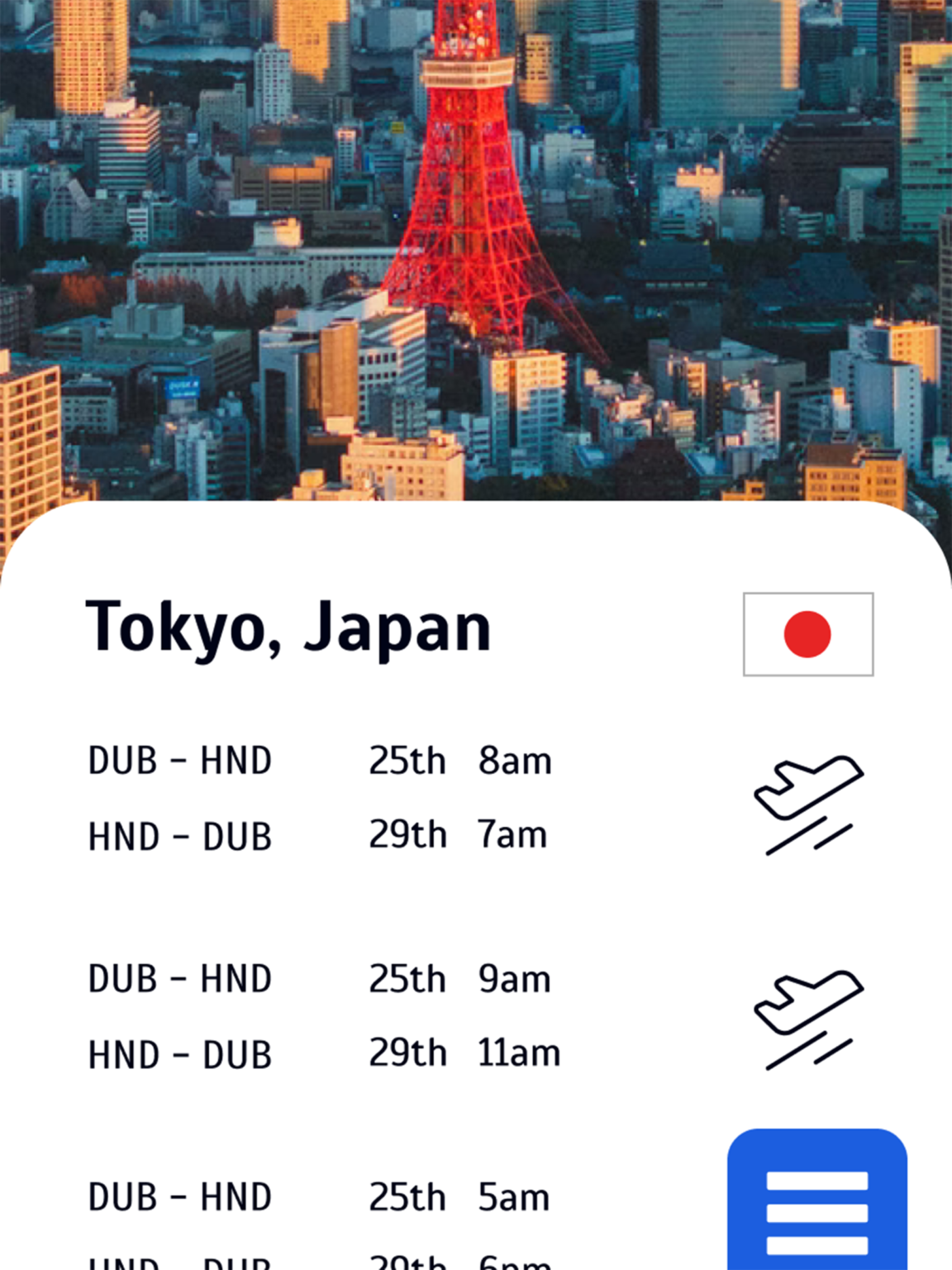
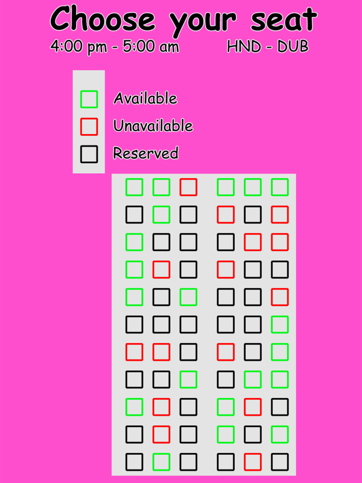
To do this, two designs for a travel app were created. One design followed aesthetic design principles and violated usability design principles, while the other followed usability design principles and violated aesthetic design principles.
This project was carried out to further the understanding of the relationship between usability and aesthetics in order to help identify what is most important to the user and as such what aspects of design, if any, should take priority.
Design Characteristics Affected: Perceived Aesthetics
The results of this project showed that perceived aesthetics was significantly affected by the manipulation of design characteristics, with a statistically significant difference observed between the two app designs. While a difference was also observed for perceived usability, it was not statistically significant.
This shows that the low usability design principles present in the HA-LU app design did not have an effect on the participant's perceived aesthetics.
The lack of a statistically significant outcome for usability could be due to the concept of visual clarity which suggests that when aesthetic design principles are followed, usability design principles are likely being followed at the same time and vice-versa. The researcher attempted to strictly follow and violate each set of design principles but there may be intrinsic links between the two that make this difficult or, in some cases, potentially impossible.
While not statistically significant, a difference was observed with the HA-LU app (which violated usability design principles) scoring higher on perceived usability than the HU-LA app (which followed usability design principles. Aesthetics appeared to be the more important design characteristic overall.
Personal Learning
It was challenging to design the two different versions of the travel app. Actively going against the design principles I have learned over the past 4 years was strange at first but it was enjoyable to work within the restrictions I set for each app i.e. high aesthetics but low usability principles for the HA-LU app.
I ultimately found that the line often blurs when deciding whether something is an aesthetic design characteristic or a usability design characteristic. When I followed aesthetic principles I usually ended up following usability principles too and vice-versa.
I also became much more proficient with Figma over the past year while working on this project.
- Jake C Pillow
- Jake Richardson
- Killian Schonfeld
- Lynda Brady
- Mark Byrne
- Jason Chatham
- Jack Condron
- Alessia Merkes
- Teresa Riney
- Nicholas A Rooney
- Clíona Gaffrey Moran
- Emilija Gostautaite
- Jacob Green
- Angela Hegarty
- Katie Jenkinson
- Torna Johnston
- Molly Kavanagh
- Stuart Kavanagh
- Dora Krstulovic
- Kate Stafford
- Ciara Little
- Clodagh McCarthy
- Jordan Mc Donnell
- Yvonne Mc Nulty
- Ciaran Nally
- Chloe O'Connor
- David O'Hagan
- Ana Paula N. Borges
- Armandas Bendaravicius
- Amy Lee Benton Byrne
- Eden Bryan
- Gemma Clabby
- Peter J Conlon
- Owen Cooney
- Emer Curran
- Alison Deegan
- Matthew Delaney
- Niamh Dennehy
- Lukas Dillon
- Megan Doherty
- Samuel Edomwonyi
- Andrea Farrelly